
To better understand technique, many art students will at some time be given the task of replicating the masters. It's a great way to learn and is useful for learning dashboard design in Tableau as well.
The Tableau Public community share an incredible amount of tips and how-to's as well as some amazingly innovative and clever tricks. A lot of people I talk to don't realize that you can download most of the workbooks people have posted (just look for the download note on the bottom right of the viz) and that the author knows that their work is out there for all to see and have graciously agreed to share it with you. You can open the workbook and look behind the curtain to see how they worked their magic. It's not considered stealing, so long as you give credit (the nod).
So next time you see a viz of the day or a blog post with a cool viz, download it and try to replicate it with your data. It's a great exercise - you will find that your learning grows in leaps and bounds this way. I think we all learn something much better when we've struggled with it, rather than just having someone show or tell us how.
A perfect resource for this is Alan Smithee's 'Team Geiger' workbook, there's a ton of charts to replicate. Another cool tool is Jonathan Drummey's Conditional Formatting workbook - some of these tricks are no longer necessary with version 8, but there's many I still use. There's so many more I could recommend - the list is getting too long - so check out Ramon Martinez's site for an exhaustive list of Tableau sites and data viz resources.
For dataviz inspiration (outside the Tableau community), check out Lynn Cherney's Pinterest - she has some amazing resources on there. And then there's Periscopic - I have lost whole Saturday's on that site. Plus, they did a beautiful project on the Fraser River Basin, which is in my backyard.
 Another great inspiration resource is web design, especially for UI. One of my favorites, Abduzeedo, posted a great collection of analytics design that are pretty cool. For the most part, these types of designs would never fly in the office (which is sad), but you could sneak some of the design elements in slowly and eventually build up acceptance. For some reason, this kind of design is considered great for the web, but in the office the standard is a pivot table. Different needs I guess. I do think Tableau is the perfect tool to bridge this gap. UI design is just one part of making data sensical, seeable and usable, but it's pretty important.
I've replicated a couple of the dashboards - well, as close as I could - and the exercise was well worth it. These are color combinations I would never have thought of using. I also don't get the attachment to donuts, but they work well here. Mostly though, the exercise was one of focusing on the little things - borders, shades - that are easy to ignore but do finish the work off nicely.
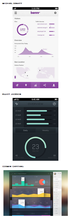
This one is by Cosmin Capitanu. I just love the color combinations and the pop-up for the max items. I couldn't think of a way to do this, but I'm sure there's some clever monkey out there that could. If anyone does come up with something, please let me know. My colors aren't an exact match, but they're close and I do like the combination.
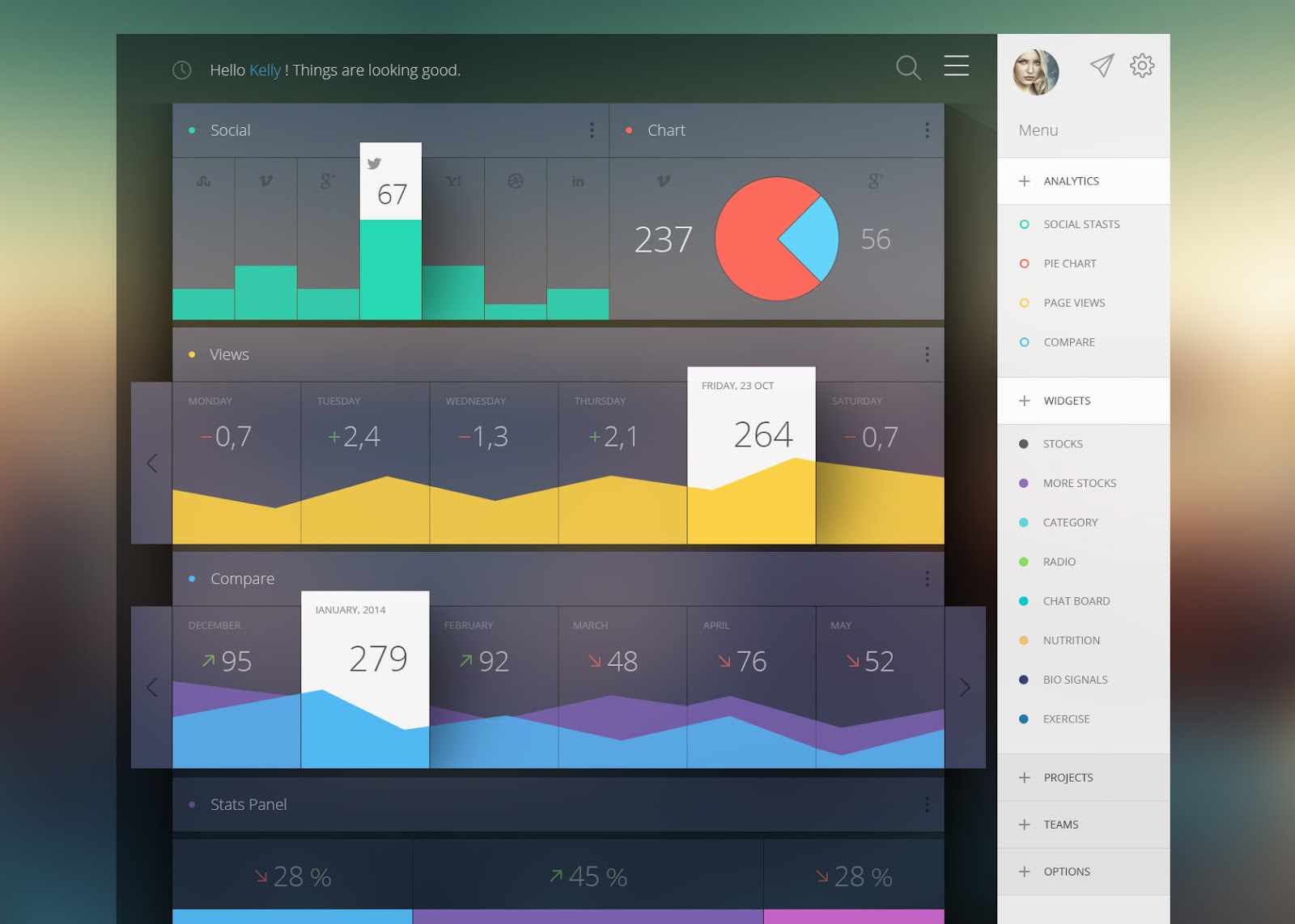 This of course is dummy data, so it's hard to get the logic of interplay. The bottom chart would not work well with real data as you never know what would get hidden, so I made it a stacked filled chart instead.
To get the axis to provide room for text on the bottom two charts, I used Jonathan Drummey's trick of adding an invisible reference band to the chart - setting it to 40% of Total and not showing the value or line or fill.
To place the total pageviews text on the bottom chart, I used Jonathan's 0.0 conditional formatting trick. I really like the use of shading and the background in this one - the free background image came from PsdKing and I placed a blank black text box behind the charts and in front of the image to get the same depth feel.
The hardest part was getting everything to align - I'm hoping Snap-to-Grid becomes part of Tableau soon. <wink> <wink>.
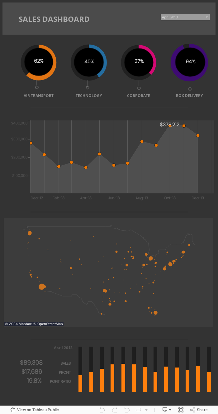
This dashboard by David Christian is a great combination of color - orange and black usually doesn't look so cool unless it's halloween. David made this for mobile, but I was lazy and made a larger dashboard (it's a lot of fiddling for a small space).
 I've used the superstore sample data here and didn't add too much interactivity, but could see where the option of selecting the different donuts to present the results in the charts below, would be a nice feature. Again, I was lazy.
About the donuts... they seem to be quite trendy don't they? Did you notice that they appear prominently on almost all of these dashboards? I think in most cases it's because they provide a nice design touch rather than are useful. Yes, you can make donut charts in Tableau; Tom Cullen at Interworks provides detailed instructions. Again, I took the lazy route and placed a black circle image over top. Lots of nudging, and I wouldn't do this in the real world, but for this exercise it was good enough.
I also drew the little doodads below the donuts in Snagit, but you can make them quickly in PowerPoint - draw the shape, right click > Save as Picture.
I do hope you'll give this exercise a shot and discover how much detail these designers put into their work. Remember - you can download any of these workbooks to see how they were made. Cheers!