
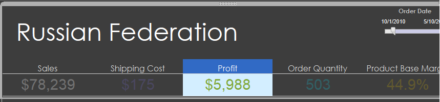
Here's a very simple solution. There's probably a better option, but this is quick. Float a text box over your chart. Yup,that simple. I put a period in the text box so that it sizes - and will change the font color to match the chart background..
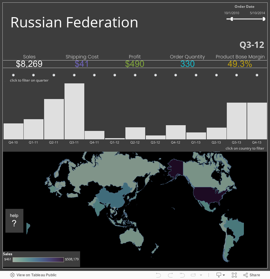
But what if you want them to be able to click on a chart to filter, but not have it zoom? Create a dual axis chart using symbol and bar, then put a text box over the bars. Click the circles to filter on the quarter.
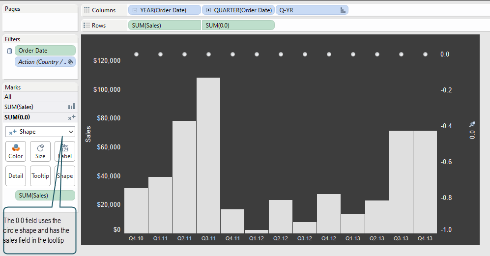
This trick uses Jonathan Drummey's 0.0 field - create a calculated field with the value "0.0". The axis for the 0.0 field is fixed to make the shapes appear at the top of the chart.
Start: -1.0
End: 0.1
 For the shape, I used a radio icon and I don't know where I got it - I think it was part of Snagit's stamps, but you could also try some of these at Mashable.
To ensure that the bars don't overlap the circles, I've added a distribution reference band, set for 120% of Maximum [Sales]. Set the label to none as well as the line and fill. The text box from the chart above covers this area.
The user can still double click on the radio buttons and cause double clicking chaos, but it'll be less likely.
I should note that the zoom controls are set to 'hide', but the ability to double-click zoom is still there.
In the help view on the map I've put instructions on how to re-set both the map and a chart.
Let me know if any of you have tricks on this one that will help users be less confused. Cheers!